Week 9 Homework: Images Speaking to one Another
So, here's how I noted down this week's homework: "Photographs of two subjects that by themselves mean one thing, but together mean something else." I paraphrase, but you get the gist.
I immediately cheated a bit - this photograph was taken about 3 years ago, before covid entered our consciousness, but it is mine and therefore, I'd argue, just about admissible:
A group of people looking at some semi-submerged cars on the edge of the River Wye which has burst it's banks. Are they the owners? What are their thoughts? What are the cars doing out there?
Then, I went out tonight after work with the thought that I would go down Oxford Street and try and get a similar sized group of people out shopping, or at least looking at goods, a photograph with a buzz of Christmas about it, perhaps with similar colours to the above, with people from behind, something having caught their interest. I wanted the photo to have similarities to the above, but to have a whole other vibe. I didn't get this photo. Instead, I got over 150 pictures which are, at best, mediocre, and 95% of which don't make the cut, aren't ones I'd want to keep, or don't in any way begin to meet the brief I'd set myself. Anyway, given I need to blog something, here are a few and some reasons they don't work:
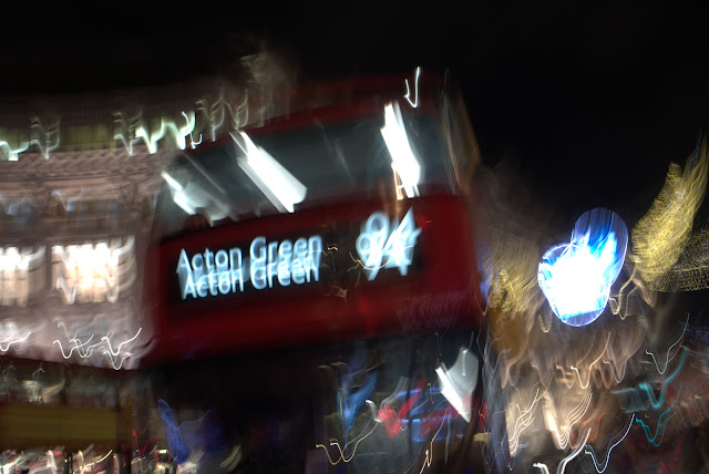
First off: London / Red / Movement / Lights / City / Busy / a harsh urban environment, a sense of danger. I was conscious of the red of the buses matching the red of the submerged cars, plus I wanted flowing movement from the left to the centre, echoing the river in the first shot, but I also wanted balance. A bit of a cliche, and crappy quality - I was using my smallest and most inconspicuous camera, an old (in digital terms) Lumix GX7 with a 17mm (35mm equivalent) lens - the same combo that had taken the picture at the top of this post. It isn't a combination that does well in low-light but using the same equipment was deliberate - I wanted the pictures to say something different apart, and something else when together, but I also wanted there to be stylistic similarities so that they were cohesive when viewed side-by-side.
Next up:
Similar ideas to above, but lacking balance. Quality holds up a bit better for the most part and for a while I thought it could work, but it isn't saying anything coherent, except perhaps the people look as if they might be a bit vulnerable, like they might be in the path of the turning bus.
A third picture:
A much more successful picture (blogger software does it no favours with the heavy compression it applies), though the destination is too clear (Dylan Thomas: "Never be lucid, never straight, if you would be regarded great."). And also: Acton Green? FFS - no, just no. Also, a long way from my original idea (people from behind looking at consumer goods, with implied greed / acquisitiveness).
So, other pictures also occurred, notably this one:
This was a bit closer to my original idea, though yellow man rather spoils the vibe and the whole thing doesn't hold together. Another version:
I don't think so. You see the idea was to have a group of people looking at something they were going to buy, stuff they didn't need. Or, in the case of the bird picture, it was meant to suggest the squandering of energy, electricity, the light used to generate the image of the bird, but it just looks like a large picture, not a projected digital image - there's no suggestion of wasted energy, wasted electricity.
This comes closer to what I was after:
But the people are too dark and the camera's sensor isn't up to much - not enough dynamic range and horribly noisy - if I raise the shadows it looks positively dirty. Besides, the picture doesn't say what I wanted it to say: You see the kicker was going to be in the title of the picture of the diptych, something like this:
GLOBAL WARMING: WHAT'S YOUR VIEW?
But it doesn't really work... the pictures aren't strong enough and are too disparate, the tones too far apart... Back to the drawing board.


Comments
Post a Comment